MemoryArt: Honoring What Truly Matters

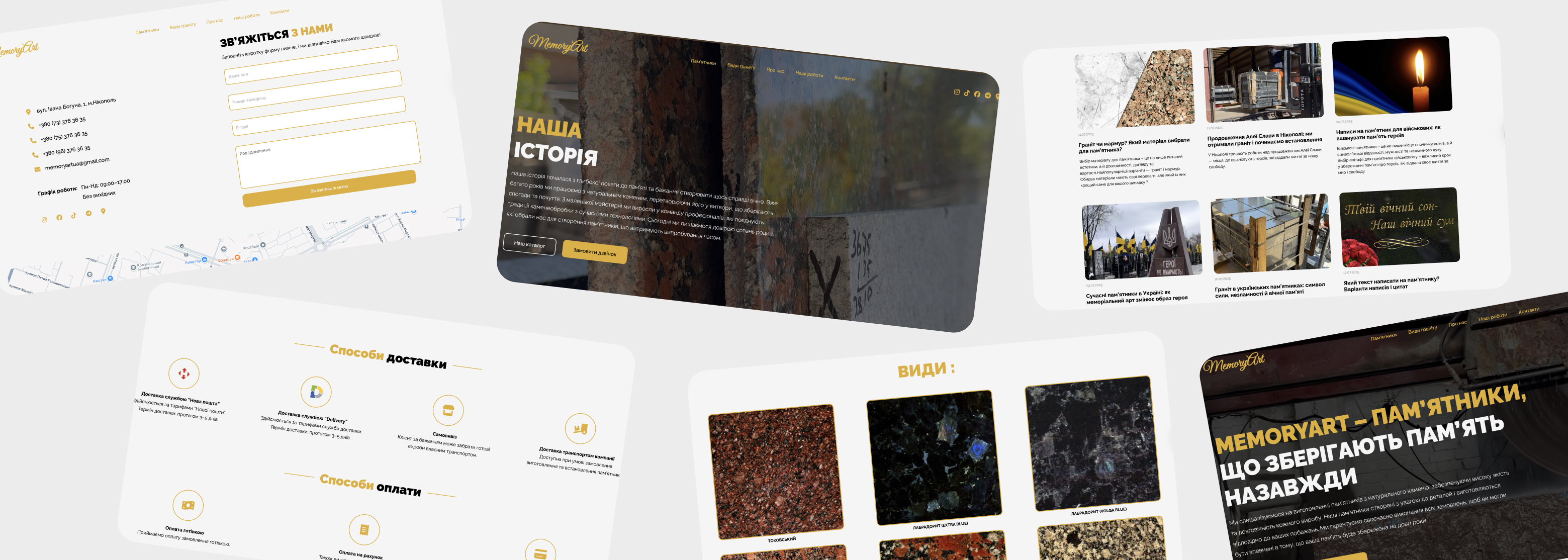
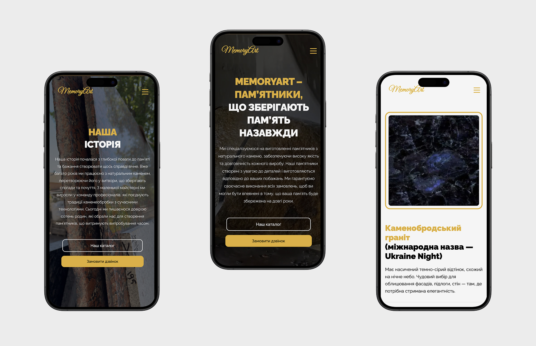
MemoryArt is a project built on empathy — a digital space dedicated to memorial design with care, dignity, and light. The redesign focused on creating a sense of calm and trust for families navigating a deeply emotional moment. With gentle colors, minimal layout, and thoughtful typography, i crafted an experience that supports, not overwhelms — allowing the memory to speak for itself.

Client
MemoryArt
Year
2025
Deliverables
Redesign
Web Development
Role
Web Design & Frontend Development

Client:

MemoryArt is a studio that creates monuments — not just as physical forms, but as lasting expressions of memory and love. Every piece is crafted with empathy and quiet strength, helping families preserve what truly matters.

The founders wanted more than a catalog. They envisioned a digital presence that feels human — one that gently accompanies users through a meaningful decision, with dignity, softness, and warmth. MemoryArt exists to make remembrance feel personal, thoughtful, and timeless.

The goal:

The goal was to design a website that feels respectful, minimal, and deeply human. We wanted the interface to be as gentle as the work itself — no noise, no pressure, just space to breathe and reflect.

From the very first scroll, the experience had to evoke trust and calm. The layout was built to support decision-making without urgency, allowing families to move through the pages with care and comfort.

Redesign:

COLORS

The color palette was selected to reflect elegance, contrast, and premium aesthetic. The combination of black, white, and golden accent (#E0AF2B) gives the brand a clean yet luxurious feel.

#000000

#FFFFFF

#E0AF2B

Additional colors

#999999

#e0e0e0

TYPOGRAPHY

For this project, I chose Raleway — a modern and elegant sans-serif font that gives the design a strong yet refined character. It’s versatile enough for both bold headlines and easy-to-read body text.

Headings and body text

Raleway

Regular   Medium   SemiBold   Bold

Sample appearance

Aa Bb Cc Dd Ee Ff Gg Hh Ii Jj Kk Ll…

Aa Bb Cc Dd Ee Ff Gg Hh Ii Jj Kk Ll…

Information Architecture:

The homepage of the MemoryArt website is built around key informational blocks, including: a product catalog, categorization by area of use, company introduction, brand advantages, blog, client section, and a contact form.
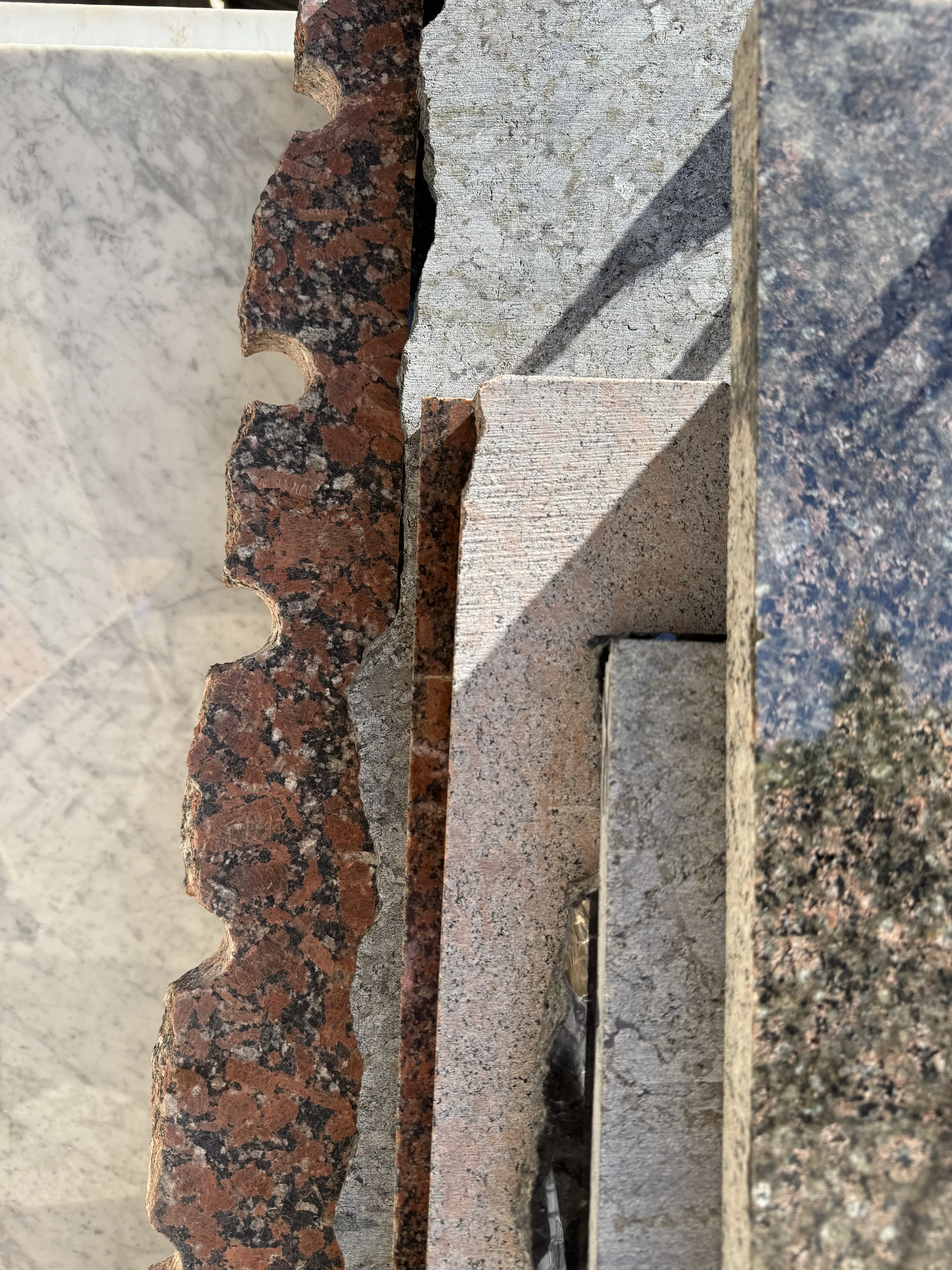
Thanks to the use of high-quality real imagery, bold headlines, and well-structured content. The structure guides the user smoothly through the main sections and helps highlight the brand’s uniqueness.

Project photo

Product page:

I designed a detailed product page for each memorial item, focusing on clarity, trust, and emotional tone.

  • Real photos from different angles
  • Material details and features
  • Usage and personalization options
  • Product variations with prices
  • Custom design on request
  • Patents or certificates if available
  • Clear delivery and payment terms
Project photo

visit website ->